What Sets Vestige Home Apart, Thoughtful Functionality
REBECCA McALPIN Photographer
VESTIGE HOME Stylist
When you choose to work with vestige HOME, our focus on thoughtful, functional living solutions is always at the forefront of our designs.
While we love a beautiful space, we also know that space needs to work hard for our clients - sometimes even serving duel purposes. Communication is key, the more that we know how you live in your home, your pain points, and your end goals, the better job we can do at designing hard-working spaces. We invest time early in Design Planning to dig into your lifestyle and to understand the aesthetics that speak directly to you and what you’re everyday design challenges are so that we can deliver personalized solutions to everyday designs problems. Today we're looking back at some of our favorite functionality moments in our designs, proving that functionality doesn’t have to be sacrificed in creating soulful spaces.
Transitional Spaces
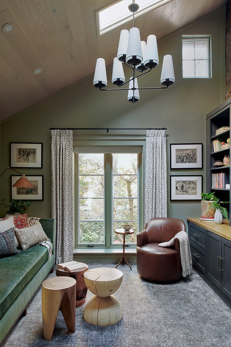
At our Society Pines Project, our clients wanted their den to be able to serve duel purpose as an occasional guest room. We custom designed this extra long, evergreen velvet sofa that’s perfect for family snuggles. With it’s walnut base and high arms, it feels contemporary, but still cozy. We built-in a sleeper element so that when company comes, they can still have plenty of room to move about the space without rearranging everything. Since we wanted to maximizing the seating in the room, we designed custom floating spalted maple side tables (made by our local woodworking friends at Leeward) giving our clients the perfect spot to set a glass and with plenty of room underneath for baskets and toys. The wall-mounted sconces were another great space saver and the wicker shades add some nice, natural texture. To maximize flexibility, we sourced free-floating wood stools of different shapes instead of a traditional coffee table. The stools are super kid-friendly and can be moved around for extra seating or tucked away when the bed is pulled out. We also added this custom-made, petite leather swivel chair. Perfectly scaled for the space, it can swivel to face the sofa or the TV and doesn’t need to be moved when the sofa bed is in use.
When designing this Nursery for the Spring 2018 One Room Challenge, our clients wanted to have a space that would transition from a nursery to a bedroom. This built-in daybed adds more functionality to the space in between the closets and we were able to include plenty of closed and open storage. We added a huge drawer for storing extra bedding below as well as a bookshelf and little cubbies for secret stashes. A heathered grey fitted sheet covers the twin mattress and is easy to just throw in the wash if needed. In the meantime, the built-in daybed provides plenty of space for the family to relax, squeeze in a nap, and cuddle-up for bedtime reading.
Entryways
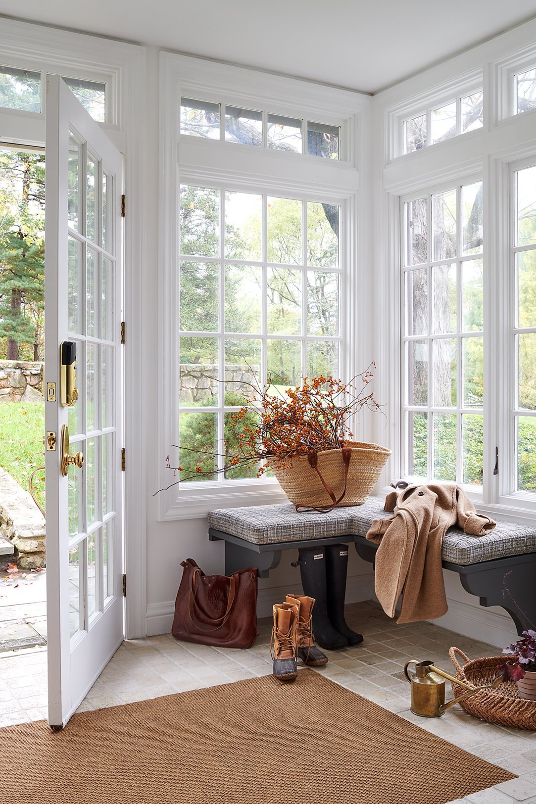
At our Charming Country Colonial Project, custom-built corner benches flank the doorway on both sides, providing plenty of room for kids and adults to come in and pull off their boots, or to bundle up for a day of snowshoeing. We topped the benches with custom cushions in a soft, blue, slightly nubby tweed-inspired fabric to bring color and softness to the bright and airy space. The door swing wouldn’t allow for an area rug inside the foyer so we removed a section of the existing tile and recessed a durable, commercial-grade mat in a soft, sisal color into the floor.
Styling by Kristi Hunter
At our Rittenhouse Revival Project, we needed to make the most of this small space entry so we measured, then measured again to plan out the custom cabinetry that could accommodate each member of the family with selves, drawers and hanging space to corral that clutter. We modified the existing vestibule window to remove a row of glass panes to fit two large custom cabinets, one on either side of the partition. Inside the cabinets, we incorporated sliding tracks to hang coats front to back (to accommodate the narrower depth due to the windows) and hooks provide storage for bags and backpacks. Last but certainly not least we updated the frame color of the windows and doors to Sherwin Williams Iron Ore to give the windows more presence and blend with the fresh feel of the other items in the space.
Flexible Seating
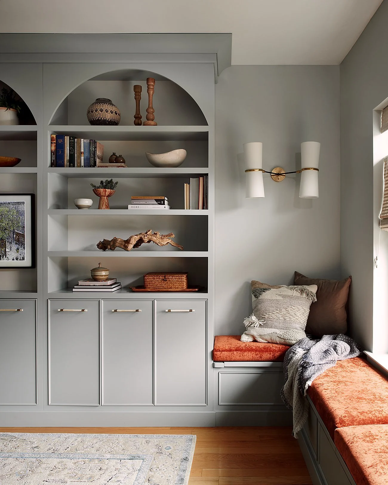
At our Traditional Graduate Project, we centered our design on a large, built-in bookcase with arched uppers to give the room major architectural interest. Closed storage below gives plenty of space to stash toys and baby items while keeping them right at hand. With the built-ins taking pride of place on the largest wall, we had to consider how the rest of the furniture would lay out. In such a narrow space the options were limited - at most we could fit a small sofa and possibly an additional chair. To take advantage of every available square foot we extended a bench off the built in creating additional seating and bonus storage. Storage compartments with hinged lids on the bench seating gave us the perfect place for larger toys, hats, gloves, and the shoes that inevitably gather by the front door. The bench is topped with custom rust cushions in easy maintenance performance velvet.
In the Whiskey Room at our If A Parisian Townhouse Was In Philly Project, custom swivel chairs came to the rescue. Since there’s a small TV in the space, our client's can be watching a game and also participating in the conversation zone. The larger blue plaid contrasts in style and form with the wallpaper and is unexpected on the more modern shape of the swivel. Overall, the rounded lines her help create flow though the space while maximizing the amount of seating. The classic leather sofa adds a sense of timelessness. Sculptural elements with the coffee table and lighting keep the space feeling modern and grown-up.
A Place for Everything and Everything in its Place
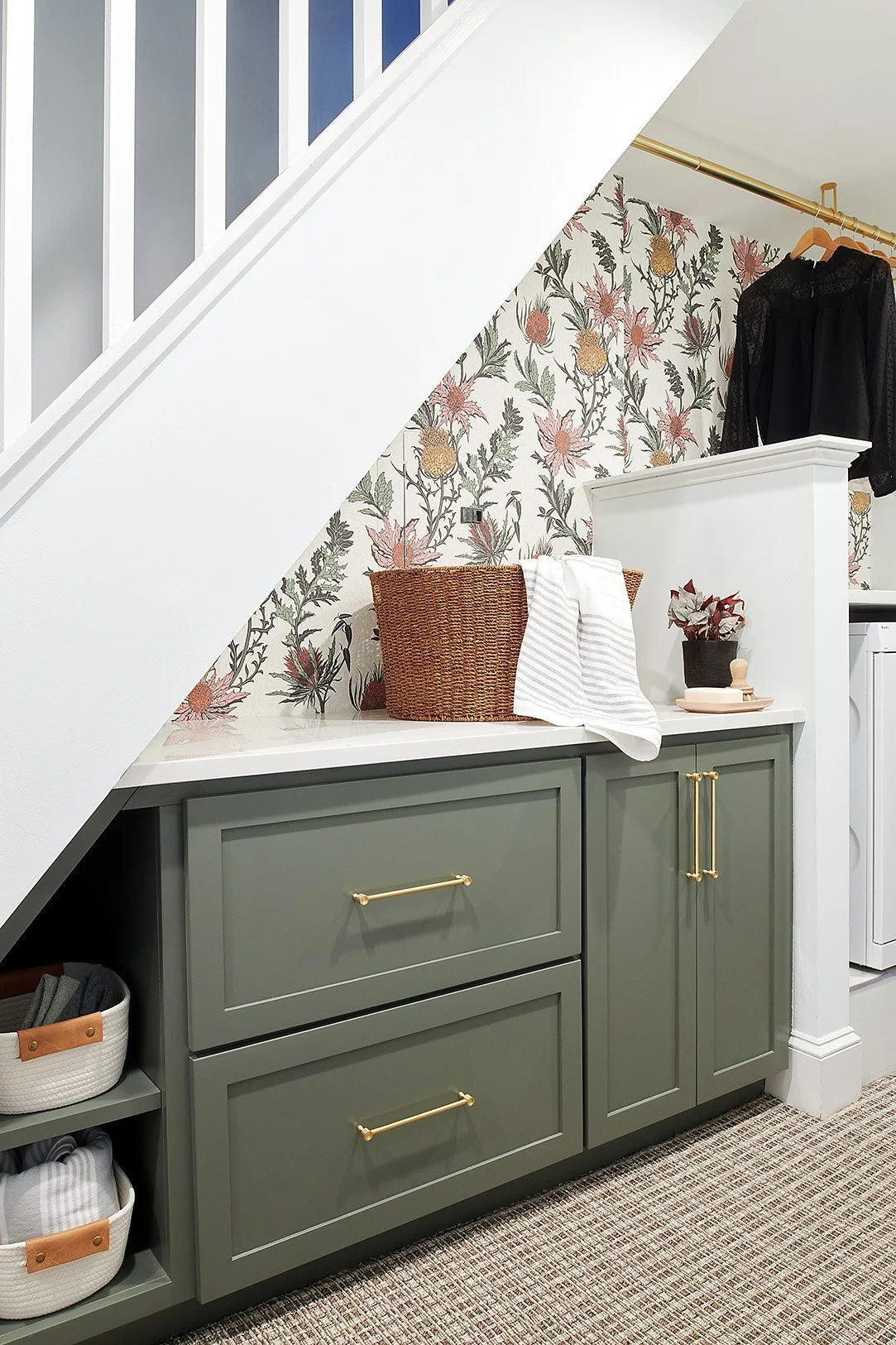
Back at our Society Pines Project, the original layout in the laundry room was lacking in function and storage so we custom designed this cabinetry to fit under the stairs with a combination of deep drawers and spot to store their tabletop ironing board. A quartz countertop above gives space for folding laundry and ironing. For additional storage and folding space we topped the washer and dryer with the same quartz and added a brass bar above, a functional and attractive spot for hanging dry laundry. The playful wallpaper makes doing laundry more fun (because who doesn’t need a little boost to tackle the laundry?) and ties into the overall natural theme in the home.
Finally, at our Charming Country Colonial Project, the primary bathroom didn’t have any vanities or medicine cabinets, so extra storage here was a must. We spent months searching for just the right antique cabinet and we couldn’t be happier with the final selection. It’s the focal point when you enter into the room and has a generous amount of storage. The scribed details and turned legs echo the rope bed in the primary bedroom without feeling overly ornate. The perfect free-standing storage solution.
Styling by Kristi Hunter
We are grateful to our clients for trusting us to create both beautiful AND functional spaces in their homes. If you’re ready to partner with a design firm that creates personalized, thoughtful solutions to help you live your best life at home, we would love to hear from you. Simply fill out our Inquiry form and our team will be in touch to set up a quick, easy 15-minute call to learn more about your project. We look forward to meeting you!


