Welcome to Society Pines
REBECCA McALPIN Photographer
VESTIGE HOME Stylist
Welcome friends to our #SocietyPines project.
If you’re anything like us, you’ve been craving more designs filled with rich, saturated colors, pattern, and personality. Perhaps its the reality of our new pandemic-era lives that is fueling our desire to create homes that are uniquely our own. We want to see more spaces that ooze comfort AND that can work hard for our families through thoughtful multi-functionality. If this sounds familiar, we have you covered.
When our #SocietyPines clients first met with us in early March of 2020, we had no idea that we were mere days away from our first Stay At Home orders. This project, more than any other, was where we really cut our COVID teeth, learning how we could continue to deliver amazing designs, despite daily business challenges. This was a project of firsts - our first mood board presentation over Zoom, the first time our client’s took over measuring, and our first virtual design presentation. Through it all, our clients stuck with us and trusted us to transform their spaces with the same dedication to service that we are known for.
Before we dive into the reveals, here’s a little bit of background on the project. This home is a historic row house in the Society Hill neighborhood of Philadelphia, Pennsylvania. When we first met, our client’s were a young family of three with a baby on the way. We were asked to design their upstairs den, adjacent powder bath, their eldest daughter’s room and laundry area. Inspired by travels to upstate New York, our client’s wanted to create engaging spaces with lots of natural references to accommodate their growing family as well as visiting family members.
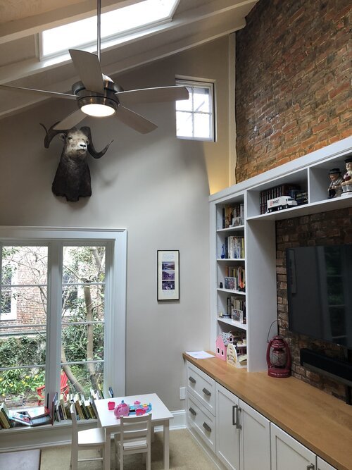
Up first, the second-story den. This was the family’s main hangout zone and television area - the spot where they relaxed at the end of the day. In addition to many design challenges, the space had issues with insulation and was often cold in the winter months. Not the most inviting situation! The original furniture was too small for the family to relax together. The space also had to function as a small office and occasional guest room. Despite the relatively small size of the room, it was a lot to pack in!
“Before” PHOTOS
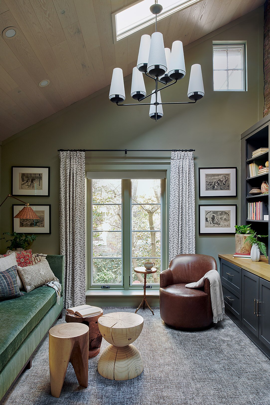
To deliver a cozy, cabin vibe, we wrapped the room in a soft green color which framed the lovely garden views outside. We worked with our friends at Buckminster Green to install a new wood ceiling, adding some great architectural interest to the room, and helping to solve the issue of improper insulation in the ceiling. We chose a soft, almost whitewashed wood to keep things from feeling too heavy. A modern take on a cabin chandelier draws your eye up as you enter the space.
The bookshelves and built-ins were part of the original space and functioned well for the homeowner so we painted them a soft charcoal color and added wood toned hardware to add visual interest. Careful consideration of the seating for this room was of utmost importance. We wanted to ensure that the whole family could curl up together. We custom designed this extra long, evergreen velvet sofa that’s perfect for family snuggles. With it’s walnut base and high arms, it feels contemporary, but still cozy. We also built-in a sleeper element so that when company comes, they can still have plenty of room to move about the space without rearranging everything. Since we wanted to maximizing the seating in the room, we designed custom floating spalted maple side tables (made by our local woodworking friends at Leeward) giving our clients the perfect spot to set a glass and with plenty of room underneath for baskets and toys. The wall-mounted sconces were another great space saver and the wicker shades add some nice, natural texture. To maximize flexibility, we sourced free-floating wood stools of different shapes instead of a traditional coffee table. The stools are super kid-friendly and can be moved around for extra seating or tucked away when the bed is pulled out. We also added this custom-made, petite leather swivel chair. Perfectly scaled for the space, it can swivel to face the sofa or the TV and doesn’t need to be moved when the sofa bed is in use.
A small office area in the room was given a simple refresh and in keeping with our natural inspiration, we commissioned Tricia from Modern Pressed Flower to create a piece of collected floral artwork to anchor the desk area.
Adjacent to the den is a small powder bath which has been renovated recently, but was feeling like it needed a bit more personality. The fixtures were up to date and there was a interesting marble mosaic floor, but the rest needed to be turned-up a notch. We couldn’t resist recommending this incredible wallpaper that coordinated perfectly with the existing floors. The locally made mirror adds an element of warmth and new wall sconces are a echo the shapes of the delightful birds seen in the paper.
With a baby on the way, our client’s eldest daughter was ready to move into her very first “Big Girl” room. Our goal in this space was to create a cozy, happy, and engaging space with areas for rest as well as play. We wanted to create a space with flexibility that can transition throughout the years. Here’s a glimpse at the original guest room.
“Before” PHOTOS
I think this is our most pattern heavy room design to date and we’re totally in love with it. The boldly-patterned wallpaper feels bright and fresh and is sophisticated enough to stand the test of time as our young client matures. We paired the bold pattern of the wallpaper with with a rug in soft tones and geometric shapes for contrast.
To keep the room open and flexible, we knew that a daybed was the way to go. It can be styled like a bed, or a mini-sofa - whatever is needed for that specific time. The blond wood tone and modern lines create a great juxtaposition with some of the more traditional elements in the historic home.
At some point in time there had been a fireplace in the room (as evidenced by the old cutout of a hearth on the wood floors). We decided to pay homage to this history by sourcing a beautiful antique wood mantle which we had stripped and restored to it’s original wood patina. We hung a lovely black floral mirror above to temper some of the overall sweetness in the room.
A cozy reading chair was a must in this space, so we went with a wing-inspired form in a playful grey dot indoor/outdoor performance fabric. Behind the chair we opened up the original closet to provide more functional open shelving for toys and books, as well as some tall wicker baskets for easy laundry storage.
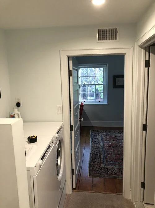
Speaking of laundry, the original original laundry area just wasn’t cutting it for our clients. The original layout was lacking in function and storage so we custom designed this cabinetry to fit under the stairs with a combination of deep drawers and spot to store their tabletop ironing board. A quartz countertop above gives space for folding laundry and ironing. For additional storage and folding space we topped the washer and dryer with the same quartz and added a brass bar above, a functional and attractive spot for hanging dry laundry. The playful wallpaper makes doing laundry more fun (because who doesn’t need a little boost to tackle the laundry?) and ties into the overall natural theme in the home. Here are the before photos followed by the newly-designed laundry.
“Before” Photos
Completed Laundry Area
That wraps things up for this amazing project reveal! We hope that you were able to come away feeling bold, inspired and maybe even a little playful. We wanted to share this generous quote from our client with all of you. We are honored to be able to create thoughtful spaces for our clients and deliver on dedication to stand-out service.
Nicole and the vestige HOME team
“Working with Nicole and her team at Vestige HOME has been a pleasure. In the setting of COVID, they encountered some expected challenges with delivery/supply chain/delays, and they handled all of it expertly and professionally. Their level of supervision, follow through, and attention to detail was excellent; if there was ever an issue they noticed it and rectified it before we even knew. Nicole, Emily, and Maureen were all a pleasure to work with. They’re practical, reasonable, smart, and good at what they do from design to execution. Thank you so much for making our den cozy, our daughters room lovely, and our laundry area SO much more functional.”
— Society Pines Client


