A Charming Country House - Part One
REBECCA McALPIN Photographer
KRISTI HUNTER Stylist
In late 2020, our clients from our #SocietyPines Project made the big decision to purchase their dream country house
in beautiful New Hope, Pennsylvania. Just an hour outside of Philadelphia where they have their primary residence, the new home would be a weekend escape for our clients with their two young girls. They asked us to create our vision for an English Country House, using the surrounding landscape as our inspiration. Sign us up! The historic property dates back to the 1800’s and our clients wanted to avoid any major construction to the home, retaining the original character whenever possible.
This is our largest project to date and was almost a year in the making. Through the spring and summer, installation after installation, we made slow and steady progress despite inevitable project delays (thanks COVID!). You can take a look back at some of the progress searching the hashtag #CharmingCountryColonial on Instagram but we’re going to jump right to the good stuff here!
We will be sharing the spaces in batches over the next three weeks. Up first is the Living Room, Dining Room and a small lounge area nestled between the two spaces.
The Living Room
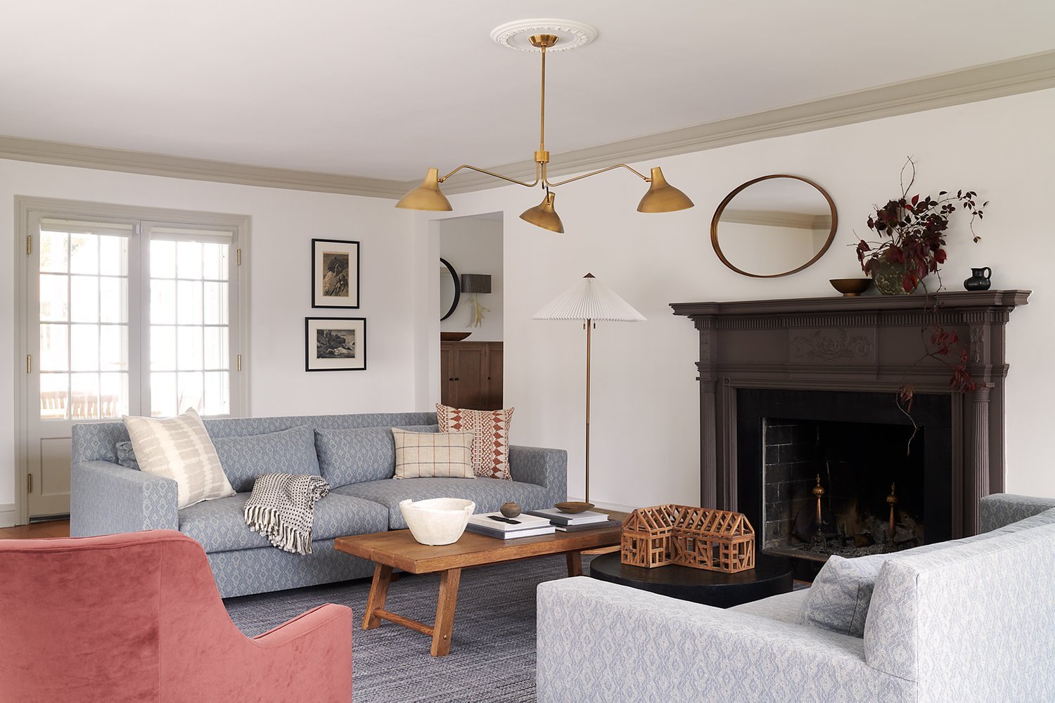
We knew that this large living room needed some intimacy to create a warm, comfortable space ready to host friends and family. With a room this grand, it’s so important to get the scale of the furnishings just right. This a more formal gathering space so we leaned into symmetry to create the conversation area around the central fireplace with two large custom sofas in a textural fabric with a subtle pattern. Pulling from the blues in the sofas, a huge custom rug balances the overall scale of the room and surrounds the seating area.
We paired the sofas with two reworked vintage Baker chairs in a durable coral velvet. The original chairs had a lower portion that protruded out more than we cared for so we had our upholstery shop rework them to make smooth front. I love how the slope of the arms and backs contrast with the more boxy sofas. The soft blues and tonal reds keep that heritage vibe going without being overly expected.
With the formality established with the furniture pairings, we had fun adding some design tension with unexpected elements. Mismatched coffee tables instantly bring some quirkiness to the room and allow flexibility of movement. The central fireplace was painted a rich purply-brown that shifts with the light. Modern lighting choices throughout the room temper the traditional elements and add a level of youthfulness for our young family. Pops of black in the coffee table, side table, and the Windsor-style bench keep your eye moving around the room and ground the space.
The Dining Room
In the Dining Room, our clients wanted us to keep the focus on the sweeping bay window views of the meadow down to the pond, where on any given day you can watch deer gather at dusk. We kept the design elements super-simple with a huge rustic trestle table (it’s very “New Hope”) that expands to easily seat twelve people for larger gatherings. To echo the bench in the adjacent living room, we paired the table with elegant Windsor-inspired chairs. With their classic lines, the chairs give a nod to the historical elements in the home. To play into the soft blue walls, we grounded the fireplace in a deep green color that complements the black granite surround.
The Front Lounge
This space is a bridge between the formal dining room and the kitchen - a place where you can sit and have a cocktail and hang out with friends while welcoming guests. We took advantage of the lovely light from the corner windows and carried the same paint from the living room into this space - soft white walls with contrasting warm grey trim.
The rug and furniture needs to be able to stand up to heavy traffic and occasional, inevitable spills. The easy-to-care-for polyester rug grounds the seating area while the deep green chairs in durable velvet can hid a multitude of mishaps. The details on these chairs are pretty darn good. We loved the velvet-wrap across the back paired with the caned sides. Easy to move side tables allow the space to be flexible. The large sideboard acts as overflow storage for the dining room and provides the perfect spot to set out drinks and snacks.
We had some fun with the white antler sconces. A nod to the outdoors, the pale white color keeps them feeling more “sculpture” and less “lodge”. The shades were custom-covered to provide texture and to add distinction to the previously all-white fixture.
Next up, the bedrooms and bathrooms! More coming your way next week friends!


