Rittenhouse Revival - Part One
REBECCA McALPIN Photographer
VESTIGE HOME Stylist
When our clients contracted us to design the first floor their historic Rittenhouse Philadelphia home, our initial visit left scratching our heads and asking…hmmmm…what were they thinking?
A remodel by previous owners had included the addition of a rounded powder bath that jutted out into the kitchen area. While certainly a conversation starter, in a home with limited square footage it wasn’t the best use of the space. Our clients needed a kitchen that could serve as a workhorse for frequent family meals and also be beautiful enough for entertaining.
The clients asked us to create a warm, modern, farmhouse-inspired space that would serve them for years to come including a full kitchen remodel, powder bath, dining room and foyer. When it came time for the kitchen, we kicked things off with this mood board filled with soft grays, blue-greens, and a hint of white oak contrasted with touches of black. Each material had to be tough enough to handle a busy family with two young boys while also seamlessly flowing with the rest of the first floor.
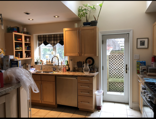
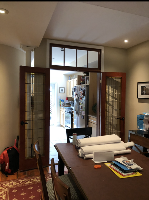
Let’s take a look at the transformation of this space shall we? Here are the before photos -
BEFORE: To the left you can see the edge of the round powder room that jutted into valuable kitchen space. Awkwardly placed french doors, poor refrigerator placement, a random support post and unfinished cabinetry created a lot of unusable space and made the whole area feel unconsidered. The lack of proper storage meant that items ended up crowding the counter tops.
We knew we needed to make the most of each and every usable inch of this kitchen and spent weeks getting the overall space plan just right. No detail was left unturned - integrated appliances like the dishwasher and beverage fridge helped provide a seamless look in the small space while custom cabinetry was scaled to even the most narrow bank for additional storage. The overall space plan was reimagined to include a smaller, more appropriately scaled footprint for a powder bath.
We started the redesign of the kitchen space by removing the french doors separating the kitchen and dining room. The support post had to stay for structural reasons, but we made it a design element by wrapping it with reclaimed timber from a local Philadelphia architectural salvage shop. We said “adios” to that curved wall and added a peninsula that encourages the whole family to participate in meal prep but also pulls double duty as a server while entertaining. As with all of our remodeling projects, we developed a compressive space plan for all areas, below is the new layout.
Additional smart features that we incorporated into the space include an integrated dishwasher for a more seamless look and a Samsung frame TV that acts as a piece of art when not in use.
The peninsula is a real workhorse in the kitchen. It provides additional counter space while housing an integrated beverage center for beer and wine, and a microwave drawer with storage below. We planned a narrow bank of cabinets under the TV that can store more shallow items.
The light washed grey cabinets and handmade backsplash tile give the space a soothing feel, and the wood-look herringbone tile floors are tough enough to handle this busy space. We designed a custom range hood in white oak to bring warmth to the kitchen palette of cool grey and greens. Our clients are avid cooks so we increased the size of the range to 36” wide and added a pot filler for convenience.
Due to the layout of this room, we were unable to center the sink under the window which meant the faucet was going to be off-center as well. This “imperfect moment” was the perfect opportunity to do something unexpected so we specified the mercury glass pendant to be fixed to the left, creating balance and delight.
As we wrapped up the project our clients were so thrilled that their “kitchen went from a place we avoided other than when absolutely necessary to a beautiful family space. Nicole also helped us create beautiful and functional storage. She took our house which had a number of "problems" and found beautiful solutions both big and small.”
That wraps up the kitchen portion of our Rittenhouse project! Stay with us all week to see more including the new powder bath, dining room and foyer.
We’d love to help you make the most of your space. To schedule your consultation reach out to us anytime at hello@vestige-home.com and be sure to follow us on Instagram for the latest on all of our projects.
xo,
Nicole


