There are No “Bad” Colors
In our ongoing practice in interior design, we have learned that there are no “bad” color choices when designing.
Color is all about context and emotion. When combined with a palette of different colors, textures and patterns color can add depth and interest.
Many people tend to stick with neutral colors that feel “safe” and easy to decorate with, but with so many good options out there, it’s worth taking a look at some of the other beautiful hues out there that can bring life and interest to your space and make it uniquely you. A few months back we posted on instagram about color instagram post and which ones seem the most challenging to work with. From that post we’ve rounded up the top colors mentioned that are difficult to work with and found a few of our favorite interiors that highlight the best uses of wall color.
RED
When using a bold and strong color such as red, we suggest keeping the rest of the palette neutral. Adding neutral colors can soften the boldness and add some great contrast.. .Full of energy and drama, red has a lot of personality and a bold presence. A saturated red can add a great backdrop, bringing the eye in to focus on a subject. Muted reds can create an elegant space that feels cozy.
PURPLE
Portrayed as elegant or soft, this color possesses many different shades to play around with. From cool to warm shades, purple paint is found in many other colors, which makes it versatile. . For those worried about fully committing to such a bold hue, try toning it down for a calming muddy purple or delicate lavender which can give a feeling of calmness and relaxation. Soft textural neutrals, warm patina wood, and soft yellows and mustards work well with a variety of purple tones.
SALMON
A great way to play around with pink, salmon can be an elegant solution to a variety of spaces. The hue can range from a soft muddy colors, to a more vibrant rich pinky red, to almost coral colored tones. Blacks, grey, and warm wood tones are great pairings with salmon.
BROWN
Brown can be used to create a cozy and rich environment. Brown is commonly associated with warmth and comfort and since it is the color of earth, it can be grounding and comfortable. Pairing it with contrasting colors such as black and white with modern furniture gives a room unexpected drama and contrast. Soft linens, blues, and copper can give give the room a more traditional feel.
YELLOW
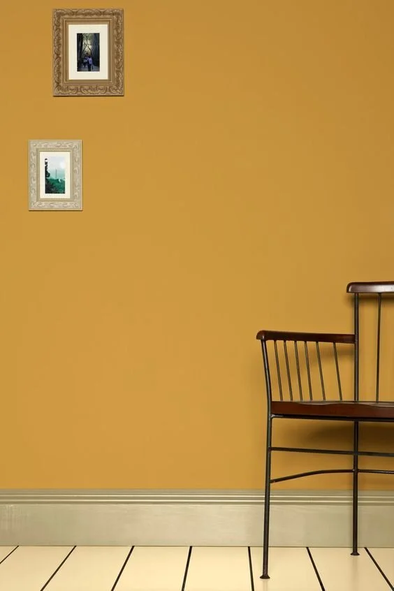
Vibrant colors can be a little intimidating. Perfect for a cheerful and bright room, yellow is a great color choice to add positive energy and always have a sunny room! Yellow adds a warm and cheery feel when paired with analogous tones. This color is recommended in tight spaces because it makes the room appear bigger, giving a sense of depth and illusion of sunlight. To balance a space with such a bold color, try adding earth tones, such as wood furniture and plants.
We hope this post has left you with the feeling of trying something new in your spaces if you’ve been feeling ready for a change. Although neutrals can be great, bold and unusual colors help alleviate visual boredom and make your space feel uniquely you. Remember, color works in harmony with other colors and materials in the surrounding environment, so it’s all about the context of what is paired with it to create the environment overall. There are many positive effects of embracing bold hues in your home, and you shouldn't let the negatives scare you away. It's only paint, after all, so at the end of the day, repainting is a low risk move compared to trying a new color - so don’t be afraid to play around!
xoxo,
The vestige HOME team


