Rittenhouse Revival - Part Two
REBECCA McALPIN Photographer
VESTIGE HOME Stylist
Hello friends! Welcome back to our week of reveals for our Rittenhouse project.
We hoped that you loved the reveal of the kitchen (in case you missed it, click here to check it out!) and today we are excited to share not one but two spaces with you - the new powder bathroom and foyer. First up, a tiny but exciting powder bathroom.
THE POWDER BATHROOM
A small powder bath is the perfect opportunity to have a little fun with design and this one certainly checks that box. Let’s take a look at how this space came to life. In case you missed the reveals earlier in the week, here’s a little skinny on the “before”.
A previous remodel of the home had included the addition of a powder bathroom to the first floor but was installed with a huge curving wall that ate up valuable square footage. We knew that it was one the the first things that had to go to give our clients the space they needed for a full kitchen remodel. The wall was promptly removed and we designed a space with only the necessities. You can check out the “before” photos below.
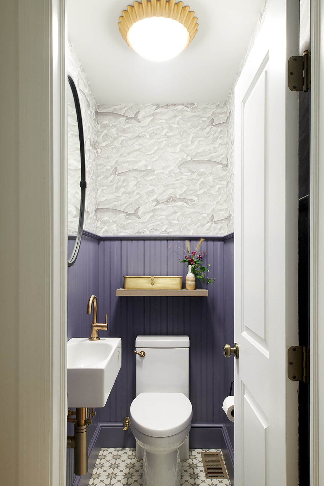
This room was a perfect opportunity to get creative and have some fun with finishes. A cement look tile (but actually porcelain for easier maintenance), wainscoting, playful wallpaper, and a statement light fixture make this room a little jewel box. We installed a wall mounted sink that doesn’t take up any floor space, helping to optimized the floor plan. A pretty brass box keeps personal items out of sight.
In a small space like this one, even the tiniest details carry so much more weight - there’s no where to hide a mistake! We worked with our contractors to source all of those exposed elements like plumbing and even the HVAC vent cover coordinated beautifully. The grey tones in the wallpaper echo the colors in the tile floor helping the space to feel cohesive. And speaking of that wallpaper, how much fun are those graphic whales (some with turtles on their backs!) dancing through the waves? We wanted to give our clients and anyone else using this powder room a feeling of delight every time they stepped in this space and this wallpaper does just that. Satin brass fixtures help to balance out the cool tones in the space and will feel classic and chic for years to come.
The wall-mounted sink is designed to accommodate small bathrooms. With a sleek, compact design and faucet on the side, the design conserves valuable space. Champagne brass fixtures add some shine to the space while giving it a timeless feel.
THE FOYER
One of the best parts of my job is designing spaces that truly function day-in and day-out for our clients. I LOVE projects that present an organizing challenge - bring it on! You may not know that as a young adult I served in the Navy as a Surface Warfare Officer and that training still influences me today, we had to pack tightly and efficiently while living ship for 6 month deployments. Our Rittenhouse clients were lucky enough to have a great light-filled foyer but it just wasn’t pulling enough weight for the family. It was overcrowded with all the daily “stuff” of life and there wasn’t enough room for the items our clients needed to have at the ready on a daily basis.
We needed to make the most of this small space so we measured, then measured again to plan out the custom cabinetry that could accommodate each member of the family with selves, drawers and hanging space to corral that clutter. We modified the vestibule window to remove a row of glass panes to fit two large custom cabinets, one of either side of the partition. By choosing a white finish, the unit does not feel overwhelming in the space. Inside the cabinets, we incorporated sliding tracks to hang costs front to back (to accommodate the narrower depth due to the windows) and hooks provide storage for bags and backpacks. Last but certainly not least we updated the frame color of the windows and doors to Sherwin Williams Iron Ore to give the windows more presence and blend with the fresh feel of the other items in the space.
From an oversized powder room and non-existent storage space, we delivered two fresh and functional spaces customized to the clients needs. Sure, pulling together all the pretty parts is always fun, but thinking in-depth about how to help our clients live well in their homes is always our main goal. We are thrilled to help bring function and peace of mind to our client’s lives. There’s one more space to reveal this week so be sure to check back and follow us on Instagram for all of the latest updates on our projects.
If you’re thinking about a project in the upcoming months, let us know by filling out our initial inquiry form here.
xo,
Nicole
END OF PART TWO


