A Charming Country House - Part Two
REBECCA McALPIN Photographer
KRISTI HUNTER Stylist
Welcome back friends.
It’s Part Two of our reveal for our #CharmingCountryColonial project and today we’ll be heading upstairs to the bedrooms and bathrooms. In case you missed Part One, you can read all about the Living Room, Dining Room, and Front Lounge here. We have had so many requests for paint color sourcing from this project that we are excited to be able to offer a paint sourcing guide as an exclusive for our email subscribers. Here is a link to sign up if you haven’t already.
For the bedrooms and bathrooms, we designed each space to be unique while still flowing easily with the rest of the home. We loved the opportunity to bring in influences of Colonial design adding style and functionality that’s perfectly at home in this grand country house.
Primary Bedroom
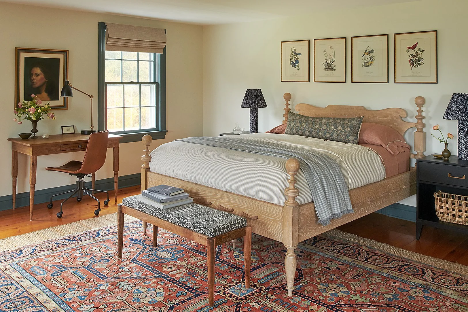
With the generous scale of the primary bedroom, we were able to create a space that can serve multiple purposes including plenty of spots for lounging and working from home on longer weekends. The room is flooded with plenty of natural light throughout the day, opening up the opportunity to pull a bold, fully saturated blue-green from the vintage rug for the contrasting trim. The contrasting trim and long peg board bring in that Colonial-era charm. We couldn’t resist this amazing bed with its lovely decorative rope detailing. To temper the historical details, we brought in modern night stands in a black stain and quirky cloth-covered pleated lamps. Pops of black with the closet hardware, articulating desk lamp, and blocky side table move your eye though the space and add a masculine influence. To take advantage of the incredible pond views from this room, we had the window seats covered in a blue-green check to pick up on the trim color. Finally, we updated the 90’s brass closet hardware to something more in keeping with the style of the home - creating a lovely focal point as you enter the room.
Primary Bathroom
For the attached primary bathroom, we didn’t want to do a full remodel but we created cohesiveness to the primary bedroom by leaning into that contrasting trim from the bedroom with a rich dark charcoal. Since the bathroom doesn’t have any vanities or medicine cabinets, storage here was a must. We spent weeks searching for just the right antique cabinet and we couldn’t be happier with the final selection. It’s the focal point when you enter into the room and has a generous amount of storage. The scribed details and turned legs echo the rope bed without feeling overly ornate. Finally, a runner softens the hard surfaces and adds a bit of that cozy factor.
Daughter’s Room
Not to play favorites… but this room! With gentle light streaming in throughout the day, we designed the space to be warm and soft, just like a hug. A bold floral rug to adds youthfulness and a playfulness to the space while grounding the furniture arrangement. We’d been hanging on to these vintage bed frames for what seems like forever and this was the perfect project for them to shine. We gave the frame a refresh with a coat of moody paint. Another peg rail means there is plenty of space to keep things right at hand and display any treasures. We had the reading chair upholstered in performance fabric for longevity and we loved how the fabric was just a bit grown-up. A small desk with cubbies for artwork and homework rounds out the room.
Jack-and-Jill Bathroom
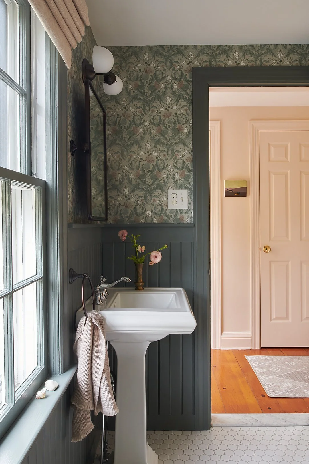
Attached to the daughter’s room is a lovely Jack-and-Jill bathroom. The original layout of this space felt okay, but our clients wanted to update the materials. We kept everything in its original place while updating the tiles on the walls and floors and the beadboard that wraps the room. We upped the personality of the space with a new mirror, modern light fixture, and charming wallpaper. The thistle wallpaper, inspired by meadows on the property, provides just enough pattern to contrast beautifully with the soft pink bedroom and provides a layered and eye catching transition from space to space. We went with a rich green for the beadboard and trim to keep the room feeling classic and sophisticated.
Guest Bedroom
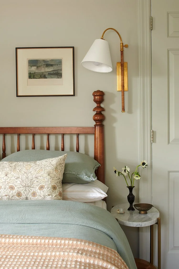
For the Guest Bedroom, we wanted to create a quiet, simple retreat. The room is wrapped in sea glass blue. A crewel-style rug is a subtle reference to the history of the property and with rust and cream tones, it’s a perfect counterbalance to the soft blue. We were able to use part of our client’s antique bed frame as a headboard and we love the way that the rich wood plays with the other colors in the room. A woven bench anchors the foot of the bed and provides a place for overnight bags. With very little space on either side of the bed due to the multiple doorways, we sourced dainty marble side tables. Wall sconces free up the table tops and add a modern contrast to the antique bed frame.
Part Three of our #CharmingCountryColonial is coming your way next week! Be sure to follow along with us on Instagram for more behind-the-scenes content from this special project!


