Blue But Better in New Jersey
REBECCA McALPIN Photographer
KRISTI HUNTER Stylist
I’m over the brown…This was the comment we heard over and over as we walked throughout our clients home during her initial interior design consultation in the early part of 2021.
Her home, a large, brick home nestled back into a wooden lot in Warren, NJ had been updated several years earlier and our client was craving a fresh, new look. And the all-over brown look was out! With a focus on the lower level, including a home office, kitchen refresh, wine room, powder room, family room and beautiful sunroom, where we created a serene sanctuary anchored in blue (our client’s favorite color) that feels eclectic and completely fresh. Welcome to our #BlueButBetter project.
THE FAMILY ROOM
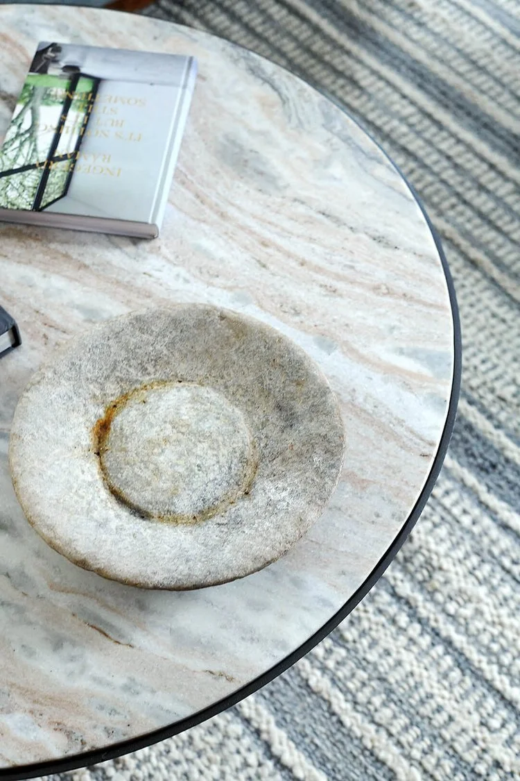
Let’s kick things off in the heart of the home. As a couple who often host and entertain their kids and grandkids, the primary focus in the family room was to create a comfy, inviting, and modern space, with kid-friendly fabrics and a streamlined flow for entertaining and relaxing. This room is the space for everyone to pile in, watch movies, and enjoy the fire so we leaned into the cozy. A large scale, custom, L-shaped sectional generously anchors the room. With its large footprint, we looked for ways to create bit of softness and airiness so we designed gently sloped, more dainty arms, and a wood base accentuated with tapered legs. A round marble-topped coffee table promotes good flow around the sectional and the soft colors and undulating pattern add interest. To keep the room feeling grounded, we added a black stained credenza to anchor the TV area and a beautiful, burgundy velvet chair with a custom ottoman and statement floor lamp for a cozy reading spot by the fire.
Probably the largest transformation in the space was the reworking of the 90’s era brick fireplace. We removed the tired brickwork details and mantle and re-clad the fireplace in natural-hued ziellege tile stacked in a vertical pattern. A reclaimed wood mantle further warms up the space and a honed black granite hearth - a durable and practical solution - is a perfect balance to the dark credenza.
THE SUNROOM
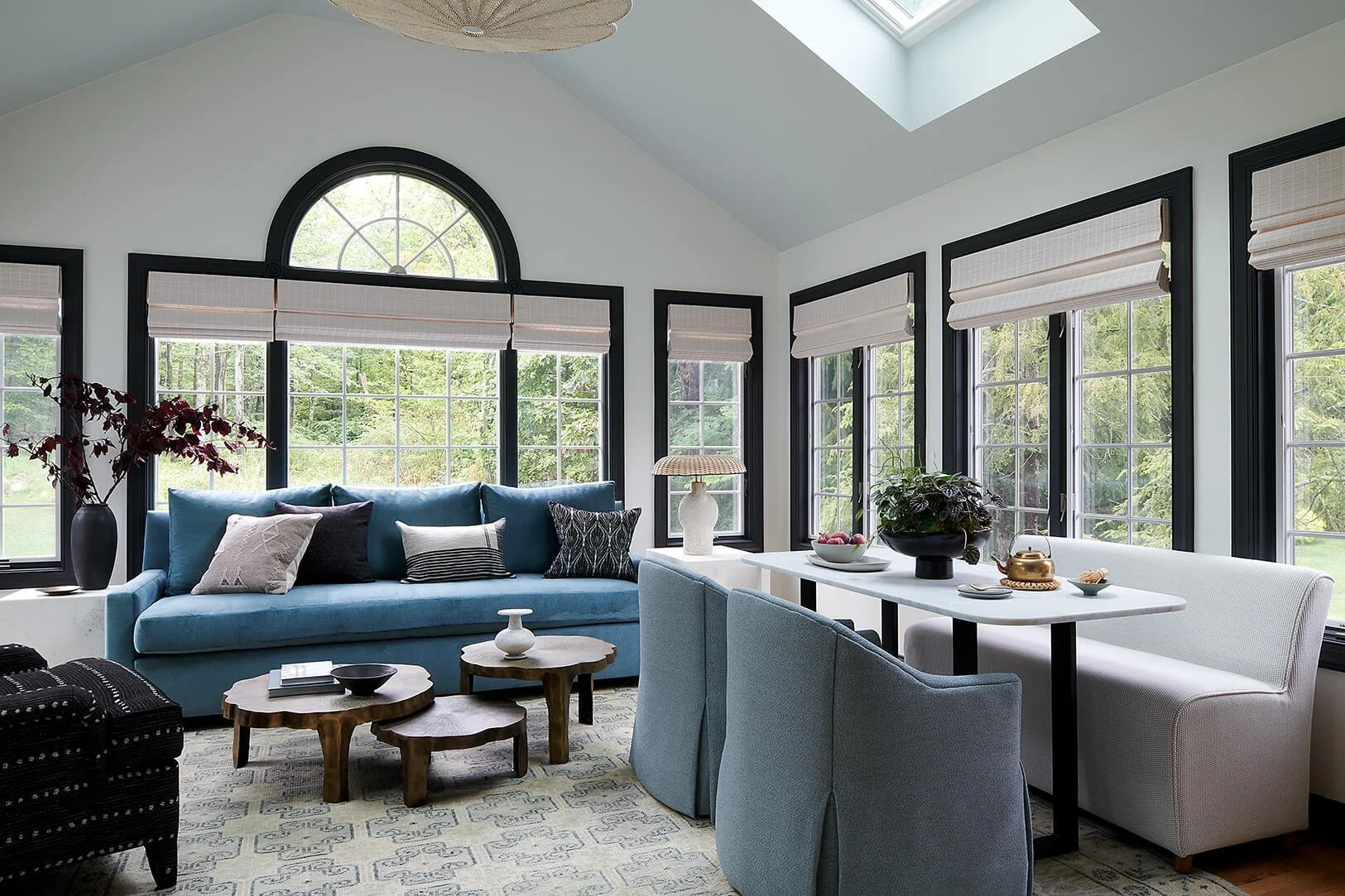
Adjoining the family room is the sunroom, which is bathed in sunlight from the rows of windows and skylights above. To offer light control, we added softly textured shades throughout, and all of the fabrics in the the space are indoor/outdoor fabrics for extra protection from the UV rays. The original space was short on seating for big family gatherings so we enlarged the sofa and the box arms are the perfect spots for perching. For maximum flexibility, lightweight “lily pad” metal tables can be easily be moved to accommodate multiple seating arrangements. To round out the seating area, we designed a curvy-legged chair with a lovely rolled arm detail, modern textural black upholstery, and fully-upholstered legs for lounging with coffee or a glass of wine. For family games or breakfasts, a marble topped table with petite banquette sits on the right side of the room. A black rattan cabinet adds plenty of storage for books and games.
THE WINE ROOM
In between the kitchen and family room is what we dubbed the “wine room.” This space, which was more like a hallway before we started the project, is a great example of creating a big moment in a tiny footprint. We saw this space as an opportunity to create a little moment of “wow” with some gorgeous Willam Morris wallpaper, custom wall sconces, new countertops, new plumbing and a bold black paint finish on the cabinets. Now instead just being a pass-through, it is a wonderful focal point to be viewed from bot the kitchen and family room.
THE POWDER ROOM
In the powder room we had another opportunity to create a “jewel box” space. We took advantage of the existing panel moulding wainscoting to find the perfect abstract wallpaper which created a bold and graphic feel and a bit of tension between the traditional feel of the wainscoting. A custom designed,, reeded vanity in solid walnut anchors the sink area and offers storage for this small space. Smart details like a push latch door streamline the face of the cabinet. A free-form organic mirror adds an unexpected element to the space.
Powder Room “Before” and “After”
Reflecting back on this project, I’m still impressed by how our team used custom interior design solutions and furnishings, without major structural changes, to transform this home from “boring and brown” to modern, fresh, and warm - all the while keeping functionality top of mind. When you hire a designer, one of the top things that we bring to the table are solutions that are above and beyond what can be achieved by the average homeowner and we really met that mark on this project. The end result is easy and lived-in, filled with moments of delight that will made even more delightful by the memories shared with family and friends. Be sure to follow along on Instagram as we reveal more “before” and “afters” from this project, including the kitchen refresh! And if you’re ready to create a home that reflects the life that you want to live, we’d love to hear from you. vestige HOME is proud to offer full-service interior design in Philadelphia and beyond. We encourage you to reach out through our Inquiry page and our team will be in touch to set up an easy discovery call to learn more about you, your home, and how we can design solutions to create your dream home.
Cheers friends!
Nicole and the Vestige Home Team


