Society Hill Towers Project Reveal
BRIAN WETZEL Photographer
When our clients first contacted Vestige Home, they were ready to make a big move from Boston to Philadelphia to enjoy a more walkable lifestyle in our historic city in their retirement. Both academics with a passion for history, art, and design, they decided to make their new home in the iconic Society Hill Towers in Old City, Philadelphia.
Our clients fell in love with the walkability, history, and charm of Old City, but they felt uncertain of how to bridge their love of traditional style (they were coming from a traditional home with a collection of antiques) with the modern architecture of the iconic I.M. Pei building. When we had our first meeting with the clients, they specifically referenced our ability to create layered, eclectic spaces and had confidence that we could gap between their love of traditional British antiques and styling and the iconic mid-century architecture of the Society Hill Towers to create a home that felt fresh and new, but also just like home.
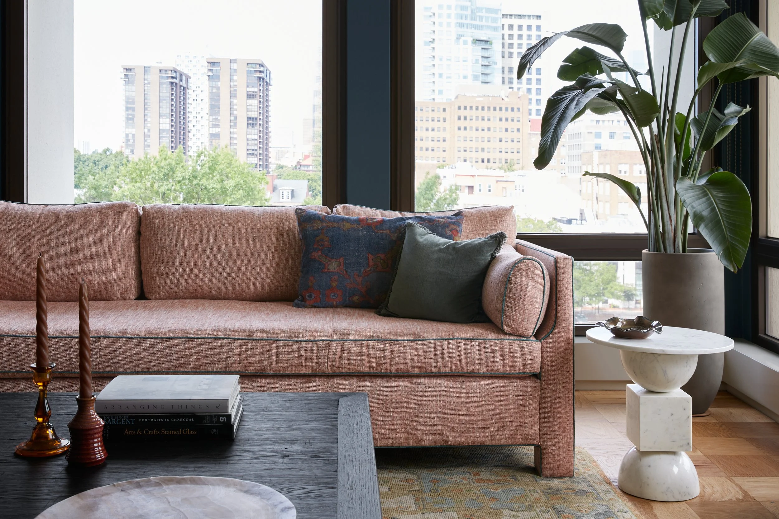
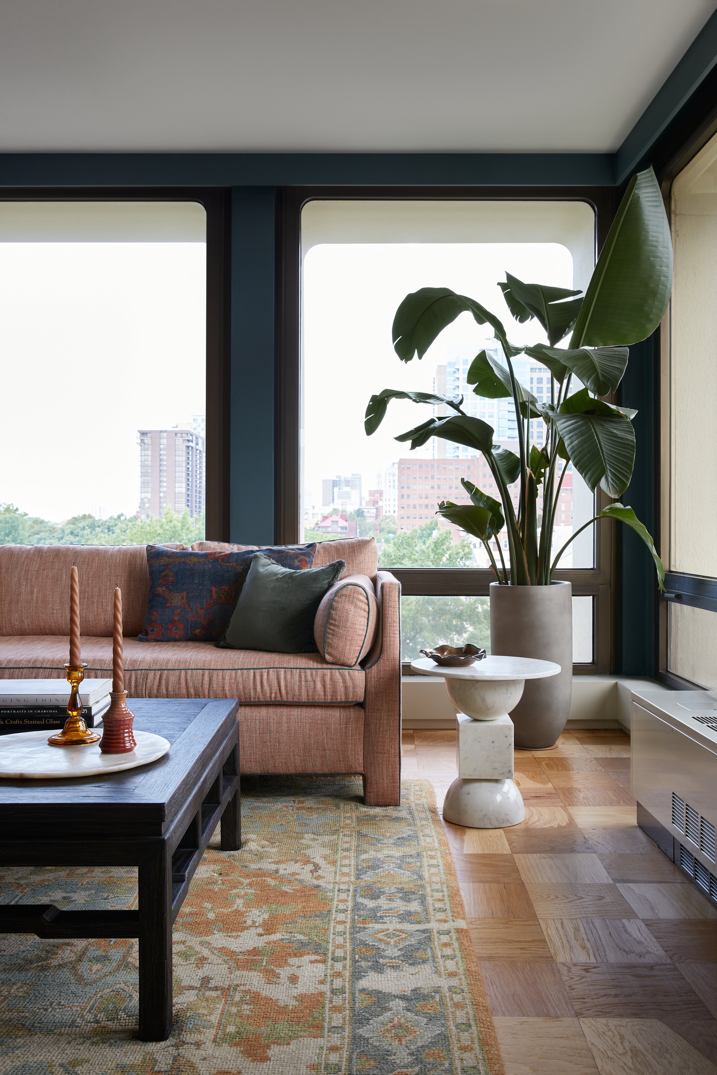
The Society Hill Towers were designed in the early 1960’s by the architect I.M. Pei, one of the great architects of the 20th Century. Along with the Towers, Pei also designed the John. F. Kennedy Memorial Library, the west wing of the Boston Museum of Fine Arts, and the glass pyramid of the Louvre Museum in Paris. Constructed of poured-in-place concrete, each unit in the Towers features striking floor-to-ceiling aluminum-framed windows set in a deep concrete screen. The units have striking views of the Philadelphia cityscape as well as the Delaware River and surrounding iconic bridges.
The architecture of the building couldn’t be ignored in our designs, but to make our clients feel at home, we added layers of softness, color, and pattern to contrast and highlight the original building details.
Throughout the home, we called back to the shape and style of the window bays and echoed that shape in the curves of the furnishings, the details of the millwork, and even the arching pattern of the wallpaper in the primary bedroom. The colors throughout are rich and saturated, but a little muddy so as to not overwhelm the smaller scale spaces and gorgeous views outside. By bringing in playful and unexpected patterns, we created a balance with our client’s traditional elements and antiques.
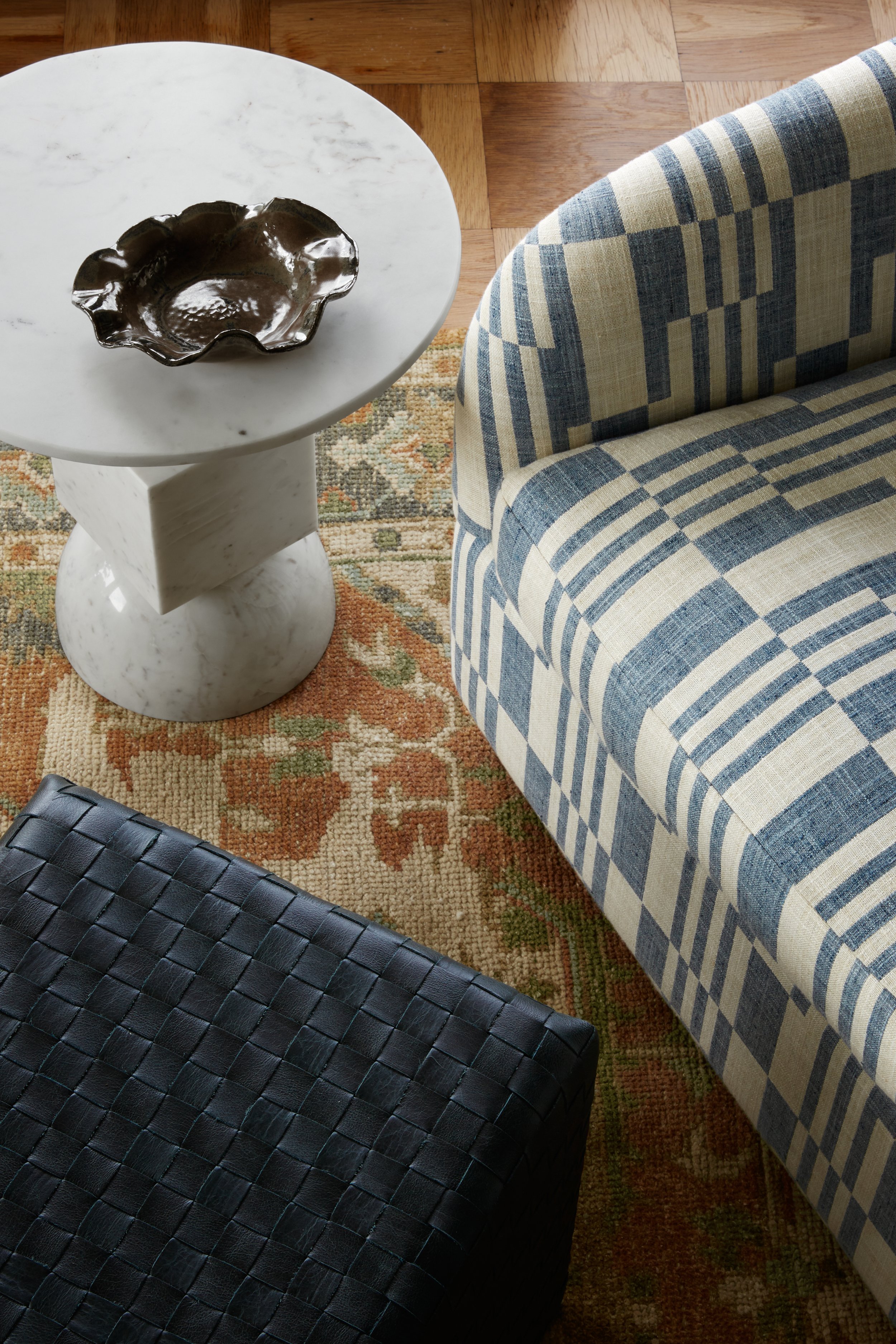
In the main living area, we focused on creating a floor plan to make the most of the breathtaking views that overlook Old City and then worked in our client’s collection of antiques and traditional furnishings and art with a balance of new, custom, and some mid-century inspired pieces.
The open living room and dining room are ready to welcome family and friends with generous seating including a custom banquette and large dining table – perfect for entertaining.
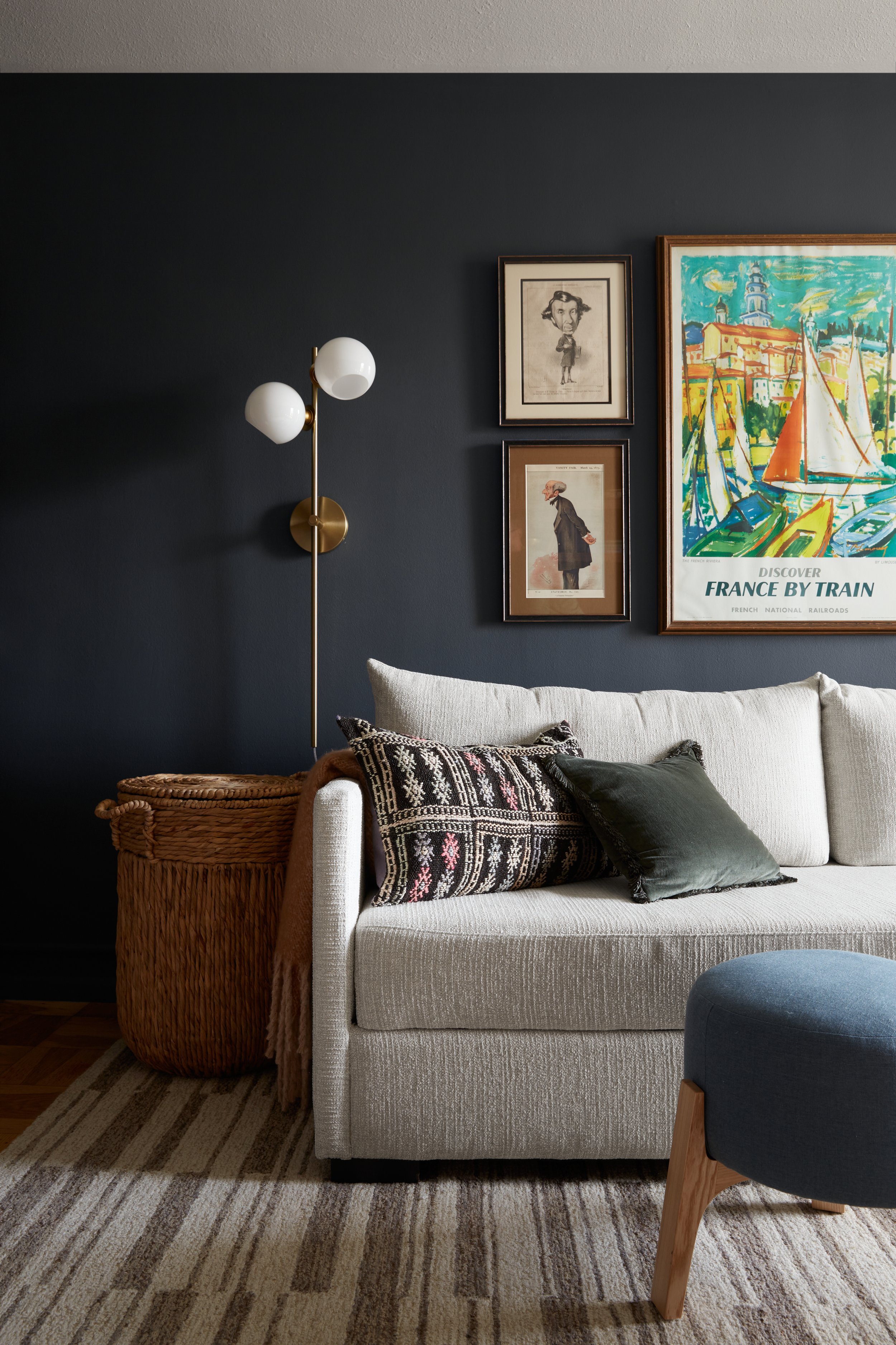
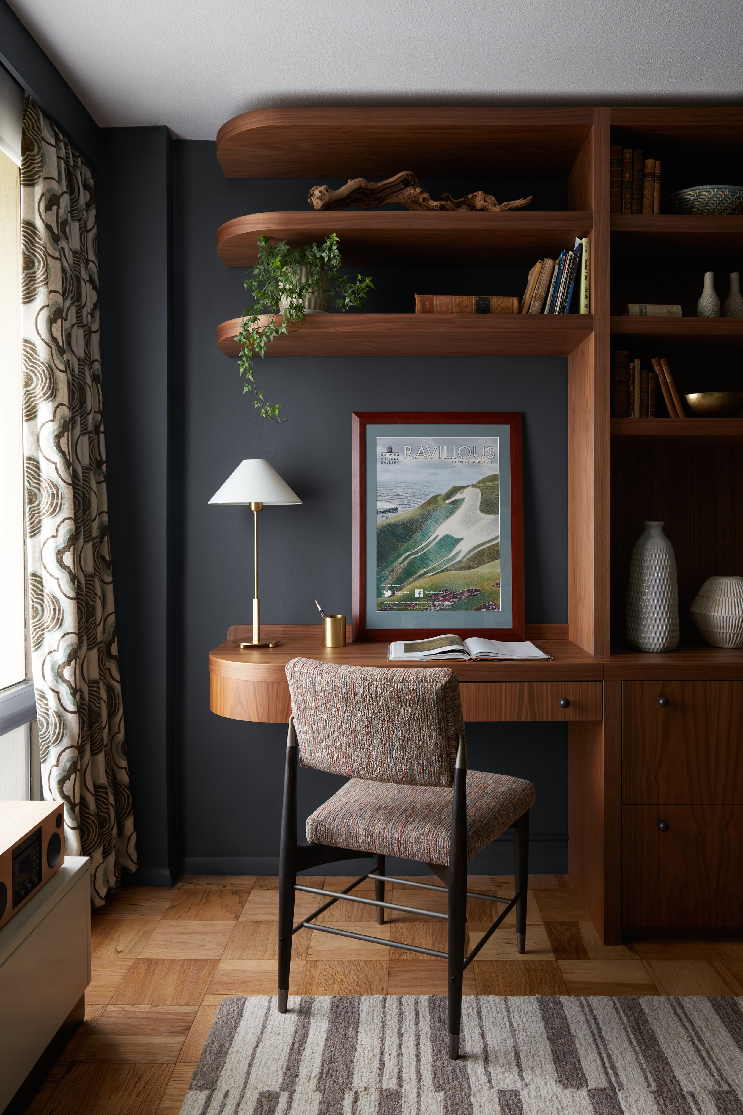
In the second bedroom, we created a multi-functional space that serves our clients as an office and TV room but can easily welcome guests when the sofa is converted to a guest bed.
The wall of custom millwork offers plenty of space for displaying treasured art and collections while keeping files, printers, and sound equipment out of sight. The solid walnut wood feels warm, leans mid-century, and pairs nicely with the dark blue walls. The wood grain on the slab doors acts as a sort of art in and of itself. We created a radius corner on the desk to provide for a smooth transition of the millwork over to the window and to reference the window shapes. The dark blue walls felt like the perfect backdrop for another gallery of the clients artwork and some fun punches of green and orange.
Our clients were looking for us to carry color and playfulness into the primary bedroom space as well. The wallpaper became the jumping off point for the color palette. The pattern felt very much like our clients personal style, and the color palette felt like Vestige Home - a perfect marriage.
We carried the cane detail from the living room chairs into this room with a warm-wood caned bed with an arched top to again echo the curves in the windows. The room is fairly small in scale so we sourced nightstands in a gorgeous saturated color that offer a good deal of storage inside and can act as overflow for smaller clothing items. Our clients had the brass lamps from their old home and we loved the idea of bringing the warm metal tone and the turned shape into the space. For a fun and more unique look we topped them with a printed pleated shade to add texture and pare down the traditional, serious feel of the base.
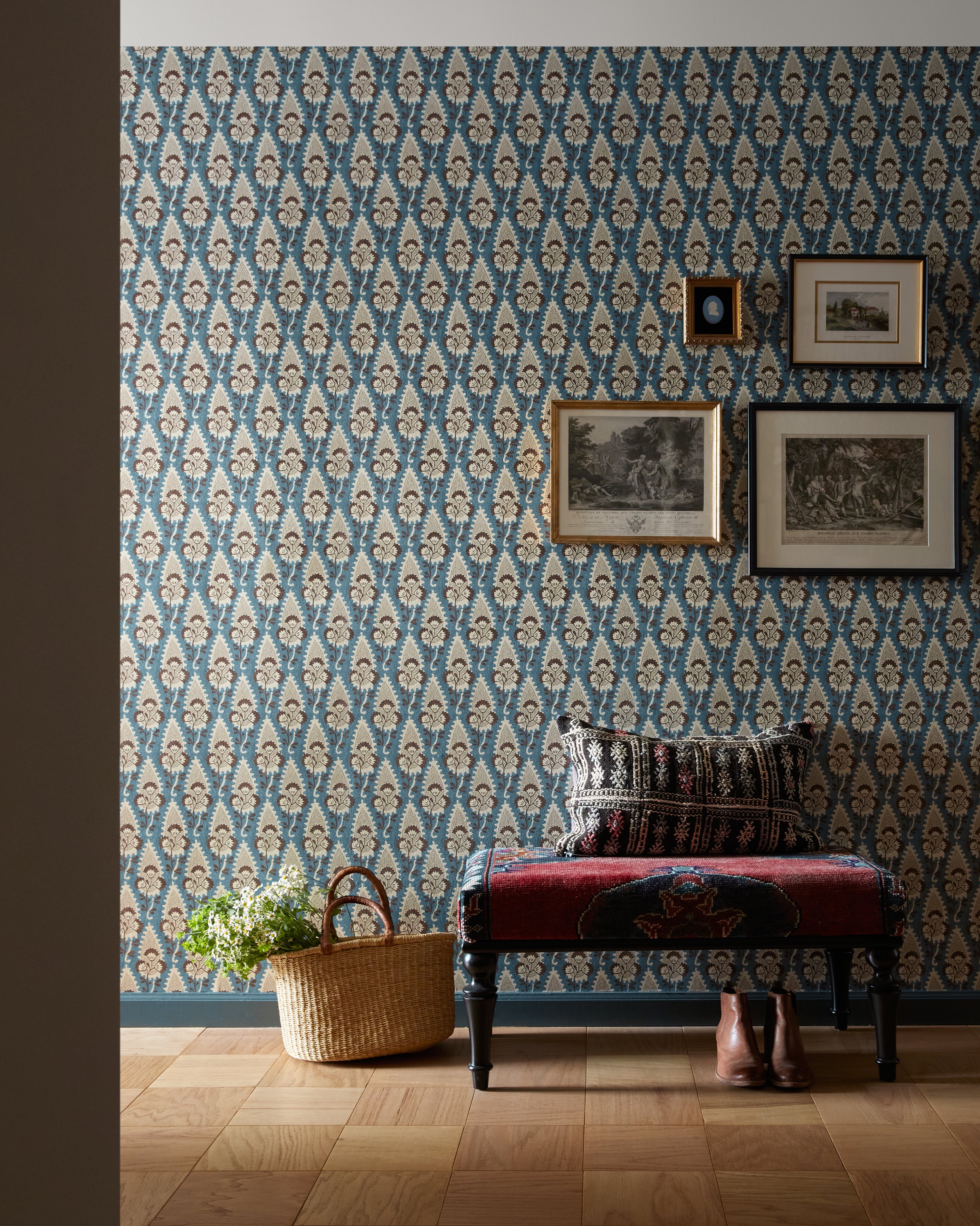
The entry is a small space that is a bit narrow and doesn’t have much natural light, so we knew we needed to make it sing as the first welcome into the home.
We sourced a gorgeous teal, cream, and brown toned wallpaper from our library and lined the entrance wall with it. It is the perfect backdrop to showcase our client’s collection of etchings, silhouettes, and other artwork. While the clients already had a built-in closet for shoes and bags, they needed a place to sit down in the entry and a colorful kilim bench with turned legs adds a nice contrast to the wallpaper.
We love how this project came together - our clients extended their trust and we stretched our aesthetic while still staying true to what makes Vestige Home feel like Vestige Home. We were able to honor the history of the space while creating a new home for our clients that feels personal and warm. The perfect space to welcome family and friends and to make plenty of new memories.
If you are considering an interiors project, we would love to hear from you. Getting started is easy and the first step is submitting an Inquiry with our team. We will be in touch to set up a 15-minute discovery call followed by an in-person design consultation. We look forward to creating your perfect home!
Cheers,
Nicole and the Vestige Home Team
Designers -
Maureen Springer
Nicole Cole Project Lead


