Our Philly Stone Queen Kitchen Refresh
REBECCA McALPIN Photographer
VESTIGE HOME Stylist
In the fall of 2018, we moved from our twin in Philadelphia to a single family home just 10 minutes away.
While house hunting, my husband Adam and I honestly considered the reality of our often all-consuming careers and we decided to look for something that was livable as-is and take our time turning it into the place we wanted it to be. Looking back, I am SO happy this is the direction we decided to go in - trust me, it was beyond tempting to be lured into a dilapidated historic home just screaming to be rescued, but it just wasn’t right for us. The new home provided us with some much needed space, privacy and a long list of to-do’s to make it into the home of our dreams.
One of the spaces that quickly rose to top of our renovations list was our kitchen. We knew that we eventually wanted to invest in a full remodel but while we are saving our pennies for the big gut we decided to take on a smaller kitchen refresh that would allow us to make the space more functional and beautiful.
The issues that I wanted to address as part of the refresh included:
Adding a dishwasher - a must-have for us
Increasing the amount of usable countertop space and adding a kitchen island
Taking the light-and-bright space down a few notches to embrace the moodier Modern English Farmhouse vibe of the rest of the house
Replacing and increasing the existing lighting
Adding open shelving for our everyday dishes and glasses
Removing the gray vinyl flooring that didn’t feel authentic to the time period of the home
Ok, so I bet you’re ready to see this space right?
Here’s some before photos…
BEFORE: An awkwardly placed stove with no workable counter space and no task lighting for cooking
BEFORE: This window looks out onto our side yard, the light fixture is definitely not our style and this area needs to function as a passageway to our back staircase
BEFORE: There’s that light fixture again…the door leads to a set of back stairs that go up to the second floor hallway which we use quite often
BEFORE: Somehow I have no before of this space at all (insert eye roll)! But, this is mostly it, minus the dishwasher which used to be a cupboard…
Should we talk about the rest of the plan for really changing up the look at feel of this space? I think so!
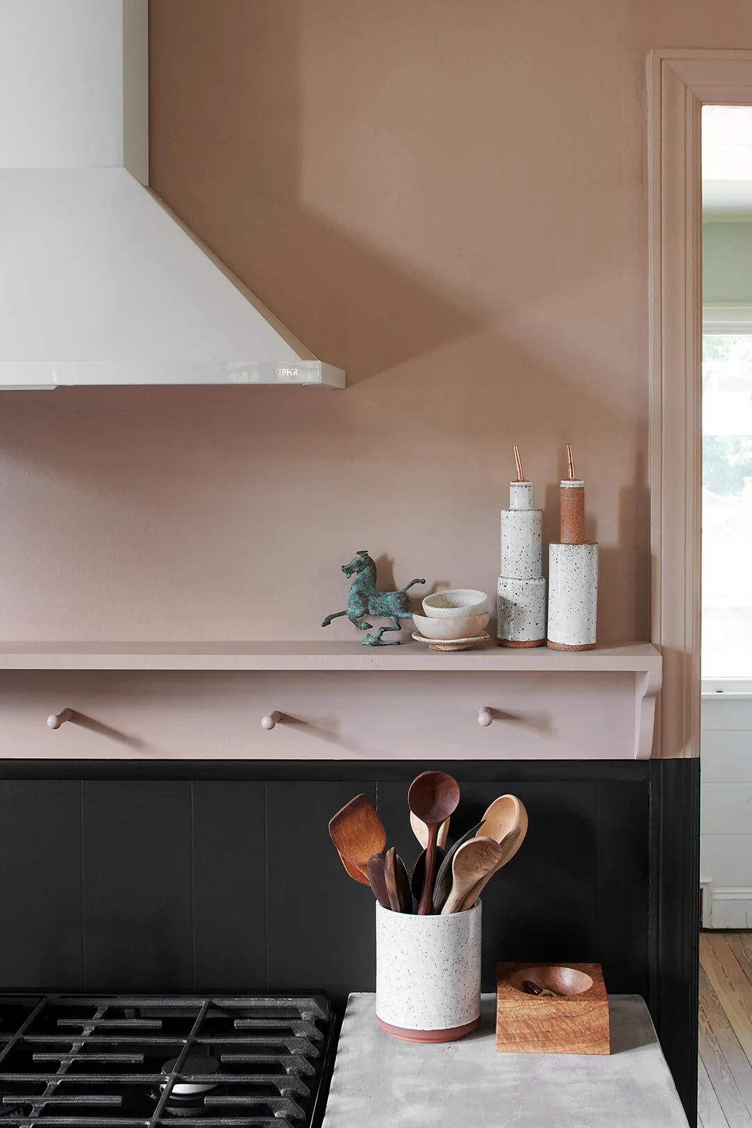
Below is the mood board that I put together before diving into the kitchen refresh. My jumping-off point was that incredible pink paint, it’s Farrow & Ball’s Dead Salmon, which I have admired for YEARS and have been waiting for the perfect space to use it in and this is it. It’s the perfect muddy, muted pink that this ultra bright room needed to bring it down to a more moody, considered space. I planned for the cabinets and wainscoting to go dark in Farrow and Ball’s Off-Black, which blends harmoniously with the Dead Salmon without being too harsh. Our window sashes went the same black color as the other ones in our home - Benjamin Moore’s Onyx. Finally, I pulled streamlined black hardware for all of the doors for a low contrast look.
This first thing we did in the space was to tackles some of the bigger functionality issues. We added a dishwasher and garbage disposal, making sure to purchase a dishwasher with an integrated panel so we can get it to more seamlessly match the current kitchen cabinets and then swap it out to match whatever cabinets we might choose in the future. For now, we went with an Ikea panel that pretty closely matches the current cabinets as well as the additional base cabinets we installed by the stove. To create the needed space to add the dishwasher we removed a section of the old cabinets and then had electrical and plumbing run to service the unit.
IN PROCESS: The cabinets were cut away to create an opening for the dishwasher. Do you see the wood floors underneath? Yay!
AFTER: Dishwasher installed with new integrated panel.
The next step was to get our our new “old” range into the space. We really loved the range in our last house so we put it in storage before moving. We were eager to bring it back into our lives.
PROGRESS: Our old range is in! We also shifted it to the center of the wall to make room for cabinets on either side.
We added cabinets on either side of the range for storage and to also to have a place to set things while cooking at the range. The new Ikea cabinets have the same drawer fronts as the dishwasher panel (which most closely matched our existing cabinets). When designing kitchens, I always like to have as many drawers as possible so that you can reach the full depth of whatever is in the cabinet, so we went with sets of three drawers that gave us space for our storage containers as well as everyday spices.
PROGRESS: Cabinets assembled and hardware added. We left them freestanding since they will needed to come out when the floors were done anyway. We added scrap plywood to the tops until they are fully installed and we add countertops.
The next step brought a major transformation in the space. We had the original fir wood floors uncovered refinished (which we did as part of refinishing the whole 1st floor) and also involved tearing up 5 (!) layers of old vinyl, plywood and tiles in the kitchen alone. We had everything tested for asbestos prior to removal but it was a backbreaking job for the crew with hundreds of nails in the floor and all the layers, it took them 3 full days just to take up the old flooring and nails.
After finally making it down to the original fir wood floors we decided to stain them with a light wash of white stain and seal them with a matte finish that minimizes any shine. It was totally worth the effort and time to get the floors revealed in the kitchen, we now have a seamless flow with the rest of the house, and they tie in the overall Moody Modern English Farmhouse vibe. I love a wood floor in a kitchen, and while it isn’t for everyone, it feels really warm and there are no transitions with the rest of the flooring from the other connecting rooms.
Our original fir wood floors were stained with a white wash and sealed with a matte finish
Once the floors were completed, it was full steam ahead to finish up the space. For additional task lighting and ventilation over the stove we added a recirculating ventilation hood, which was easier to install in the interim vs a vented hood, and added much-need light over the range. I chose a more modern style hood with a slightly rounded front and I love the way the white contrasts with the wall color and the fan is a bit quieter than some of the others I found at the same price point. We DIY’d some concrete countertops that we fabricated from wood and Ardex, loosely following the guidance of Young House Love’s tutorial. To max out the functionality of the stove area, and give it more of the English cottage feel, we added a shallow shelf above the existing wainscoting. It’s the perfect spot for my collection of functional ceramics, as well as things like oils, salt and peppers, our honey and butter jars and small bowls that I used regularly for cooking or snacking.
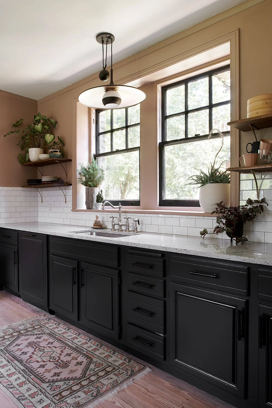
With a bank of huge windows, the wall that houses our sink is the major focal point of the kitchen. We wanted to make some big changes here for functional and aesthetic reasons. The squatty, wall mounted cabinets were removed to make room for beautiful open shelving. We added inexpensive walnut-stained pine shelving with gently curving brass brackets from Anthropologie that draw the eye upwards while giving a home to our most-used daily dishes, glasses, mugs, and a few decorative objects. The new shelves keep the wall feeling very open and adds an element of collected soulfulness to the space.
AFTER: A statement light fixture and open shelving for everyday items and a few decorative pieces creates a personal yet functional focal point wall
AFTER: I personally prefer open shelving for the ease of grabbing my everyday dishes and glasses. A vintage mirror adds a decorative touch and some height to the arrangement.
I knew I wanted a statement light fixture above the sink and when I came across the Alchemy Pendant from one of my favorite lighting vendors, Troy lighting, and fell in love. I can’t say this enough friends - sculptural lighting instantly elevates a space. The repeating spherical lines of this pendant create balance with all of the angular elements of the windows and cabinets instantly adding softness to this spot.
I knew that we had enough open square footage in the kitchen to bring in an island and after some hunting we came across this piece at Home Goods with some shallow drawers and shelving below. I topped the new island with a piece of remnant quartz and it’s the perfect landing zone between our fridge and stove and the place where we almost exclusively do our meal prep. One day I’d love to design a custom piece for this spot but we are loving the added functionality that this piece is bringing to our lives in the meantime.
And that’s a wrap on our kitchen refresh project! If you aren’t able to invest in a full remodel of your kitchen or bathroom, I would absolutely recommend considering the refresh concept. It can be a lower cost way to make your space more functional and stylish in the interim, because we gotta live for today, right friends?
If you want more peeks of the refresh process I have saved them under my Instagram highlights under “Kitchen Refresh” so you can see a little more of the action :)
We’d love to answer any questions or comments that you might be pondering - leave them below!
Cheers,
Nicole


