One Room Challenge Spring 2018-Week Two
Week two was productive as we dove head on into the project with painting the space.
But before I show you the progress on that I wanted to share a bit of the design plan with you. If you missed week one, you can catch up here. As I provide with most of my clients, creating a 3-D model of the space is the first step, this allows us to see the pieces in proportion to everything else and play around with different layouts. Here is the plan for the space as seen from above.
And here are some perspective shots of how the space will look from inside.
If you remember from the first week, the nook had a freestanding daybed in it. In it's place we'll be building a built in daybed that can be converted into bunk beds in the future if another kiddo comes along into the family. This will better utilize the space and add some extra storage.
The design concept for the space is a peaceful "modern colonial" vibe. The house is a brick center hall style colonial, and this is Philadelphia, so we're playing a bit of homage to some colonial references but with some modern twists to reflect this young couple's vibe. The pieces that I've selected allow room for growth and change in their family and many of the pieces will be able to be used in other areas of their home as their needs grow and change.
Soft, light colored woods will add a modern element and the pale, blue-green two tone walls give a peaceful feel. Charcoal and marigold accents will ground the space and give it more of a grown-up feel.
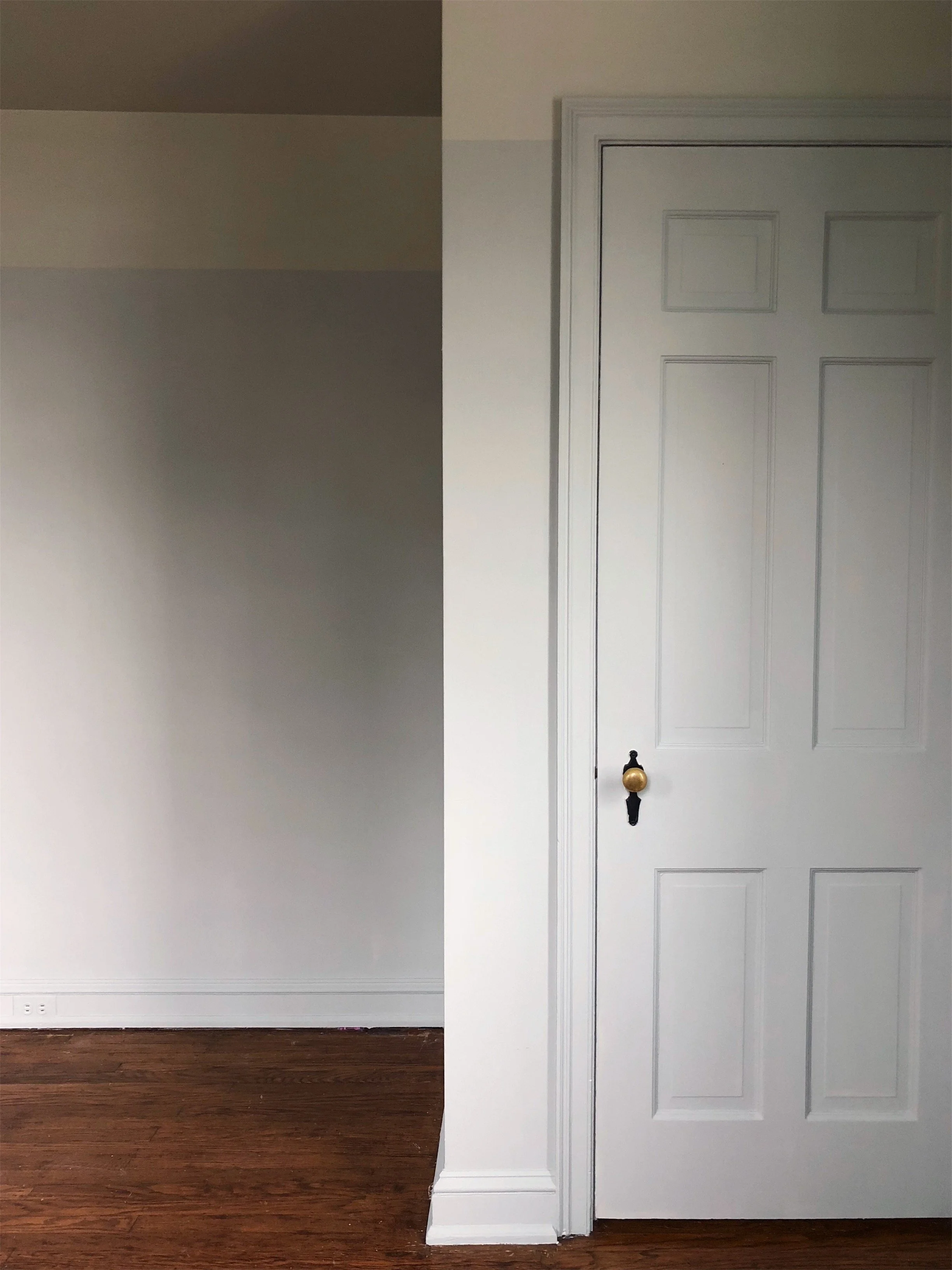
We're going with two beautiful Farrow & Ball colors for the wall, the lower portion is in Farrow & Ball No. 22 Light Blue and the for the upper portion of the wall I chose Farrow & Ball No. 266 Mizzle, which we took all the way up to the ceiling. The ceiling is a bit shy of 8' in this room so painting them the same color as the walls is a great way to extend the eye up and create a sense of a little more height in the space. We used the Estate Emulsion finish for a beautiful chalky matte finish.
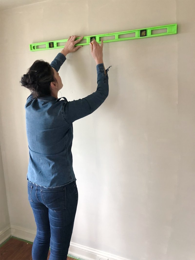
Once we had the room primed we measured out where we wanted the line where the two colors would meet, that way we knew where to paint up to. Using a 4' level all the way around the room is a great way to make sure your lines are nice and straight.
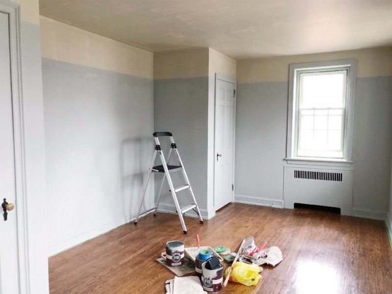
We started with the lower portion before taping off the upper portion with the best trim tape for a clean line.
The photo above is after we finished the lower portion with the tinted primer above. After three days of painting we were rewarded with the following...
We painted all the trim and doors in the Light Blue to keep the eye moving around the room without a contrasting trim disrupting and as a nod to the colonial vibe we are going for in the space.
This soothing palette has set the stage for the peaceful vibe in the space and is going to be gorgeous with the light wood tones and charcoal accents. Next week we'll be adding the crib, new overhead lighting and an heirloom piece from the homeowners so stay tuned! Be sure to follow all the other incredible guest participants on the One Room Challenge website as well as the featured designers there's so much design goodness to see over the next six weeks!


